TL;DR: Perfect Thumbnail Design Guide
Strategic design directly impacts metrics, with custom thumbnails increasing engagement rates by up to 30% according to YouTube's internal data.
Visual hierarchy is essential, requiring clear focal points, strategic text placement, and composition techniques that guide viewer attention effectively.
Color psychology drives clicks, with high-contrast complementary colors creating visual impact while maintaining brand consistency.
Technical specifications matter, including 1280×720 resolution, under 2MB file size, and proper formatting for maximum quality across all devices.
Testing and iteration are non-negotiable, as the most successful creators continuously refine their thumbnail approach based on performance data and audience feedback.
Introduction: The Power of Exceptional YouTube Thumbnails
In the increasingly competitive landscape of YouTube content, your thumbnail serves as the digital storefront of your video. Creating the perfect YouTube thumbnail isn't just about aesthetics—it's a strategic marketing decision that directly impacts your video's performance metrics. With viewers making split-second decisions about which content deserves their attention, thumbnails have become one of the most critical elements in determining whether someone clicks or scrolls past your carefully crafted content.
Think of your thumbnail as your video's first impression. In a sea of competing content, it needs to communicate value, intrigue viewers, and accurately represent what they'll experience. According to YouTube's internal data, videos with custom thumbnails receive significantly higher engagement rates—with top creators seeing up to 30% improvement in viewership after optimizing their thumbnail strategy.
This comprehensive guide will walk you through the entire process of creating thumbnails that not only catch the eye but convert casual browsers into engaged viewers. From selecting the perfect background elements to implementing advanced design techniques, we'll cover everything you need to know to master the art of thumbnail creation in 2025.
If you're completely new to YouTube thumbnails, you might want to start with our complete beginner's guide before diving into these more advanced techniques.
1. Why Investing Time in Perfect Thumbnails Delivers Results
Before we dive into the practical aspects of thumbnail creation, it's important to understand why they matter so much in the YouTube ecosystem. A strategically designed thumbnail doesn't just look good—it works hard for your channel in multiple ways:
Direct Performance Benefits
-
✅ Higher Click-Through Rate (CTR): Well-designed thumbnails can increase your CTR by 15-30%, according to multiple creator studies. This metric directly influences YouTube's algorithm in determining your content's reach.
-
✅ Improved Search Visibility: YouTube's algorithm factors engagement metrics (including CTR) when ranking videos in search results and recommendations. Better thumbnails lead to better engagement, which leads to better visibility.
-
✅ Increased Watch Time: When thumbnails accurately represent content, viewers are more likely to watch longer because their expectations are properly set.
-
✅ Enhanced Brand Recognition: Consistent thumbnail styling helps viewers instantly recognize your content in their feeds, building channel loyalty.
The Data Behind Thumbnail Importance
According to YouTube's creator insights, 90% of top-performing videos use custom thumbnails rather than auto-generated ones. Internal studies from major YouTube networks show that optimized thumbnails can increase viewership by up to 154% for the same video content.
The reason is simple: humans are visual creatures, processing images 60,000 times faster than text. Your thumbnail communicates the value of your video before a single word of your title is read.
2. YouTube Thumbnail Technical Specifications for 2025
Before diving into design principles, let's ensure you understand the technical requirements for creating thumbnails that display perfectly across all devices and platforms:
Essential Specifications
- ✔ Resolution: 1280x720 pixels (minimum width of 640 pixels)
- ✔ Aspect Ratio: 16:9 (YouTube's standard player format)
- ✔ File Formats: JPG, PNG, BMP, or GIF (static, not animated)
- ✔ Maximum File Size: 2MB
- ✔ Color Profile: sRGB for consistent color display across devices
Device-Specific Considerations
Your thumbnails will appear at various sizes across different platforms:
- Desktop Feed: Approximately 210x118 pixels
- Mobile Feed: Approximately 180x101 pixels
- Smart TV Interfaces: Varies by manufacturer, but generally larger
- Search Results: Slightly smaller than feed displays
This variation in display size means your design must remain clear and impactful even when significantly reduced. Elements that look perfect at full size might become unreadable when scaled down for mobile viewing.
Accessibility Considerations
In 2025, YouTube continues to emphasize accessibility in its platform design. Consider these factors:
- Text Contrast: Maintain a minimum contrast ratio of 4.5:1 between text and background
- Readability: Ensure text remains legible even at smaller display sizes
- Color Blindness: Avoid relying solely on color to convey important information
Following these technical guidelines ensures your thumbnails display optimally across all viewing environments, providing a consistent experience for all potential viewers.
3. Essential Design Elements for High-Converting Thumbnails
The most effective YouTube thumbnails combine several key design elements that work together to capture attention and communicate value. Let's explore each component in detail:
Visual Clarity and Quality
-
🎯 High-Resolution Images: Crisp, clear visuals signal professionalism and quality content. Blurry or pixelated images dramatically reduce viewer trust and click-through rates. Internal YouTube studies show that thumbnails with professional-quality images receive up to 40% more clicks than those with poor image quality.
-
🖋 Bold, Readable Text: When using text in thumbnails, ensure it's instantly readable even at small sizes. Text should complement—not compete with—the visual elements. Limit text to 3-5 words maximum for optimal impact.
-
🌈 Strategic Color Usage: Bright, contrasting colors naturally draw the eye in crowded feeds. Understanding color psychology (discussed in detail later) can significantly impact emotional response to your thumbnails.
Human Connection Elements
-
😊 Authentic Facial Expressions: Thumbnails featuring genuine human emotions create immediate psychological connection. Eye-tracking studies show that viewers' attention is naturally drawn to human faces in thumbnails, particularly eyes and emotional expressions.
-
👁️ Eye Contact: Direct eye contact creates a powerful psychological connection with potential viewers. When appropriate for your content, featuring faces with clear eye contact can increase CTR by up to 25%.
Composition Fundamentals
-
📏 Rule of Thirds: Position key elements along the imaginary lines that divide your thumbnail into thirds both horizontally and vertically. This creates natural visual flow and balance.
-
🔍 Visual Hierarchy: Arrange elements to guide the viewer's eye to the most important information first. Size, color, and positioning all contribute to establishing this hierarchy.
-
🖼️ Negative Space: Don't overcrowd your thumbnail. Strategic use of empty space helps important elements stand out and creates a cleaner, more professional appearance.
Mastering these fundamental elements provides the foundation for thumbnails that not only look professional but effectively convert impressions into clicks.
4. Step 1: Selecting the Perfect Background for Your Thumbnail
The background of your thumbnail sets the foundation for everything else. It establishes the mood, provides context, and determines how well other elements will stand out. Let's explore your background options and best practices:
Background Types and Their Strategic Uses
-
✅ Contextual Scenes: Using a frame from your video or a related scene provides immediate context about your content. This works particularly well for vlogs, tutorials, and demonstration videos where setting matters.
-
✅ Solid Colors: Clean, minimalistic backgrounds with solid colors create maximum contrast for text and foreground elements. These work exceptionally well for text-heavy thumbnails or when you want to create a bold, graphic look.
-
✅ Blurred Backgrounds: Taking a scene from your video and applying a subtle blur creates depth while ensuring foreground elements remain the focus. This technique combines the contextual benefits of scene backgrounds with the clarity of solid colors.
-
✅ Gradient Overlays: Applying a semi-transparent color gradient over any background type can dramatically improve text readability while adding visual interest. Gradients can also be used to create emotional tone through color psychology.
Background Optimization Techniques
-
🔍 Darkened Edges: Slightly darkening the edges of your thumbnail (subtle vignette effect) naturally draws the viewer's eye toward the center where your key elements should be positioned.
-
🌈 Color Grading: Applying consistent color grading across your thumbnails creates a cohesive channel aesthetic while allowing you to emphasize certain moods or emotions.
-
📊 Contrast Testing: Before finalizing your background, test how well foreground elements stand out by viewing the thumbnail at various sizes. If elements blend into the background when scaled down, reconsider your color choices or add separation elements like drop shadows.
💡 Pro Tip: When using scene backgrounds, position your main subject slightly off-center to create space for text or graphic elements on one side. This maintains the contextual benefits while providing clean space for additional information.
5. Step 2: Crafting Clear and Impactful Text Elements
Text in thumbnails serves a critical purpose: it provides immediate context and value proposition that images alone cannot always convey. However, text must be strategically implemented to be effective:
Text Strategy Fundamentals
-
✅ Concise Messaging: Limit text to 3-5 words maximum. Your thumbnail text should complement your title, not duplicate it. Focus on emotional triggers, key benefits, or intriguing questions.
-
✅ Font Selection: Choose bold, easily readable fonts that match your content style. Popular options include:
- Impact or Anton for bold statements
- Montserrat Bold for modern, clean looks
- Bebas Neue for compact, attention-grabbing headlines
- Oswald for versatile readability
-
✅ Text Hierarchy: If using multiple text elements, establish clear hierarchy through size, weight, and color. Viewers should instantly understand which text is most important.
Text Enhancement Techniques
-
🎨 Contrasting Outlines: Adding a 2-4 pixel outline in a contrasting color dramatically improves readability across any background. Black outlines on light text or white outlines on dark text are particularly effective.
-
🔲 Background Shapes: Placing text on semi-transparent shapes or banners ensures readability while maintaining visual interest. This technique works especially well when your background image is complex.
-
🌟 Drop Shadows: Subtle drop shadows create separation between text and background without requiring outlines or background shapes. For maximum effectiveness, keep shadows soft and short.
Text Positioning Strategy
-
📏 Rule of Thirds: Position text along the imaginary lines that divide your thumbnail into thirds for natural visual flow.
-
🔄 Z-Pattern Reading: Western audiences naturally read in a Z-pattern (top-left to top-right, then diagonally to bottom-left, then to bottom-right). Position your most important elements along this natural eye path.
📌 Examples of Effective vs. Ineffective Text:
❌ "Learn How to Create the Best YouTube Thumbnails That Will Get You More Views Easily!" (Too long, unreadable at thumbnail size)
✅ "THUMBNAIL SECRETS" (Short, intriguing, readable at any size)
❌ "YouTube Algorithm Tips" (Generic, doesn't create emotional response)
✅ "DOUBLE YOUR VIEWS" (Benefit-focused, creates desire)
6. Step 3: Leveraging Color Psychology for Maximum Impact
Color choices in your thumbnail go far beyond aesthetics—they trigger specific psychological and emotional responses that can significantly impact click-through rates. Understanding and strategically applying color psychology gives your thumbnails a powerful advantage:
Strategic Color Applications
-
✅ Contrast for Attention: High-contrast color combinations naturally draw the eye in crowded feeds. The strongest contrast comes from complementary colors (opposite on the color wheel) like blue/orange or red/green.
-
✅ Color Limitation: Restrict your palette to 2-3 main colors plus black and white for a clean, professional appearance. Too many colors create visual confusion and appear amateur.
-
✅ Brand Color Integration: Incorporate your channel's brand colors consistently across thumbnails to build recognition. This doesn't mean every thumbnail should look identical, but rather that your color palette should feel cohesive.
Emotional Color Associations
Different colors trigger different emotional responses. Match your color choices to the emotional tone of your content:
🎨 Primary Emotional Color Associations:
-
Red: Excitement, urgency, passion, danger Perfect for: Action videos, breaking news, dramatic content
-
Yellow: Optimism, clarity, warmth, attention Perfect for: Tutorial videos, positive content, educational material
-
Blue: Trust, stability, calmness, professionalism Perfect for: Business content, technology reviews, educational material
-
Green: Growth, health, prosperity, relaxation Perfect for: Finance videos, health content, environmental topics
-
Orange: Enthusiasm, creativity, determination Perfect for: Creative tutorials, motivational content
-
Purple: Luxury, mystery, creativity, wisdom Perfect for: Beauty content, luxury product reviews, spiritual topics
High-Converting Color Combinations
🎨 Proven Thumbnail Color Combinations:
- Red + White: Creates maximum contrast and signals importance/urgency
- Yellow + Black: The highest visibility combination in nature (think warning signs)
- Blue + Orange: Complementary colors that create vibrant contrast
- Green + Purple: Creates intrigue and visual interest
- Black + Neon Accent: Creates a premium, high-energy feel
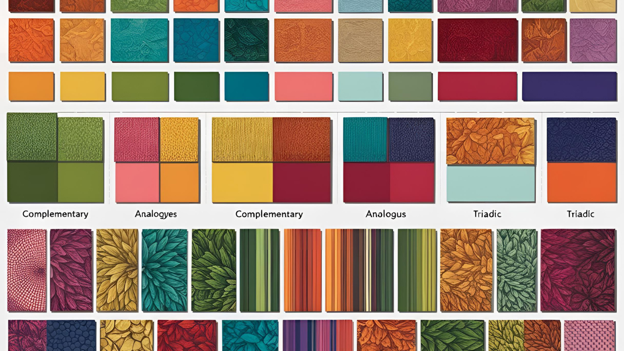
💡 Pro Tip: Test different color combinations for similar content to identify what resonates best with your specific audience. Even small color adjustments can yield significant CTR improvements.
7. Step 4: Incorporating Faces and Emotions for Human Connection
Human faces are powerful attention magnets in thumbnails. Our brains are hardwired to notice and process facial expressions, making them one of the most effective elements you can include. Research consistently shows that thumbnails featuring faces—particularly those with strong emotional expressions—generate higher engagement rates.
The Psychology of Facial Expressions
Different expressions trigger different viewer responses. Match your facial expressions to your content's emotional tone and desired viewer reaction:
-
😊 Happy/Smiling Expressions: Convey positivity, approachability, and satisfaction. Ideal for positive reviews, success stories, and uplifting content. Genuine smiles (where eyes crinkle) perform better than forced smiles.
-
😲 Surprised/Shocked Expressions: Create immediate curiosity and suggest unexpected information or revelations. Perfect for list videos, fact videos, and content with surprising elements. The more authentic the surprise looks, the better it performs.
-
🤔 Thoughtful/Confused Expressions: Signal complex information or problems being solved. Excellent for tutorials, educational content, and videos that answer specific questions. These expressions create a connection through shared curiosity.
-
😠 Determined/Intense Expressions: Communicate passion, expertise, and authority. Effective for motivational content, debates, and videos taking strong positions on topics.
Face Framing and Composition
-
👁️ Eye Contact: Direct eye contact with the viewer creates an immediate psychological connection. When appropriate, position faces to make direct eye contact with the camera.
-
🔍 Close-Up Framing: Closer facial shots generally outperform distant ones in thumbnails. Focus on expressions by cropping tightly around the face for maximum emotional impact.
-
📏 Rule of Thirds: Position eyes along the top third line of your thumbnail for natural visual flow and maximum impact.
Multiple Faces and Interactions
-
👥 Reaction Dynamics: When featuring multiple faces, create visual stories through their interactions. Showing one person reacting to another creates immediate narrative interest.
-
🎭 Contrasting Emotions: Pairing contrasting emotional expressions (e.g., one person excited, one skeptical) creates visual tension that drives curiosity.
💡 Pro Tip: If you're the face of your channel, maintain consistent facial positioning across thumbnails to build recognition. For example, always position yourself on the left side of thumbnails to create a consistent visual pattern viewers will recognize.
8. Step 5: Using Visual Cues to Guide Viewer Attention
Strategic visual cues like arrows, circles, and icons act as silent guides, directing viewer attention exactly where you want it. These elements can dramatically improve the effectiveness of your thumbnails by creating clear visual pathways:
Types of Visual Cues and Their Applications
-
✅ Directional Arrows: Arrows create immediate visual direction, guiding the eye toward your most important elements. They work particularly well when pointing at text or key visual elements that communicate your video's value.
-
✅ Highlight Circles/Ovals: Circles around important elements create focus and suggest significance. They're particularly effective for highlighting details that might otherwise be missed.
-
✅ Icon Elements: Simple icons can instantly communicate topics or themes. For example, a clock icon suggests time-saving content, while a dollar sign immediately signals money-related information.
-
✅ Pointing/Gesturing: If including people in your thumbnail, have them point or gesture toward important elements. This creates natural directional flow and leverages our instinct to follow others' attention cues.
Implementation Best Practices
-
🎯 Purposeful Placement: Only use visual cues when they serve a specific purpose. Random arrows or circles without clear direction create confusion rather than clarity.
-
🎨 Visual Consistency: Use similar styling for visual cues across your thumbnails to build recognition. Consistent color, thickness, and style of arrows or highlights creates channel branding.
-
📏 Size Appropriately: Ensure visual cues are properly sized—large enough to be visible at small thumbnail sizes but not so dominant that they overwhelm other elements.
🔍 Example Application: Adding a bright yellow arrow pointing to text reading "MUST-WATCH" creates immediate visual hierarchy and suggests unmissable content. This combination of directional cue and value proposition is particularly effective for driving clicks.
💡 Pro Tip: Combine multiple cue types for maximum impact. For example, a person pointing (gesture cue) toward text with an arrow beside it creates multiple reinforcing pathways for the viewer's attention.
9. Step 6: Building Recognition Through Consistent Branding
Consistent visual branding across your thumbnails helps viewers instantly recognize your content in crowded feeds, building channel loyalty and increasing click-through rates from returning viewers. Strategic branding elements create a cohesive channel identity while still allowing for thumbnail variety:
Essential Branding Elements
-
✅ Logo Placement: Incorporate your channel logo or icon in a consistent position across thumbnails. The top-left or bottom-right corners are typically most effective, as they don't interfere with central content while remaining visible.
-
✅ Color Consistency: Develop a signature color palette that appears across all your thumbnails. This doesn't mean every thumbnail should be identical—rather, they should feel like part of the same family through color relationships.
-
✅ Typography System: Establish a consistent font pairing and text styling approach. Using the same fonts across thumbnails (particularly for recurring elements like series titles) builds immediate recognition.
-
✅ Frame Elements: Consider adding subtle framing elements like corner accents, borders, or background patterns that appear consistently across thumbnails.
Branding Implementation Strategies
-
🎯 Series-Specific Templates: For content series, create template variations that maintain core branding while clearly indicating different episodes or topics. This builds both channel and series recognition.
-
🎨 Visual Hierarchy: Ensure branding elements don't compete with the thumbnail's primary message. Brand elements should be visible but secondary to the main content focus.
-
📊 A/B Testing: Test different branding approaches to find the optimal balance between recognition and click appeal. Some channels benefit from bold branding, while others perform better with subtler approaches.
Advanced Branding Techniques
-
🌟 Branded Frames: Adding a subtle branded frame or border in your signature color creates cohesion without dominating the thumbnail.
-
🏷️ Content Category Indicators: Develop visual systems to indicate content categories (e.g., tutorials get a blue corner tab, reviews get a red one) to help viewers quickly identify content types.
-
🔄 Evolution, Not Revolution: When updating your thumbnail style, evolve gradually rather than making dramatic changes that might confuse existing subscribers.
💡 Pro Tip: Study how major media brands maintain consistent visual identity across diverse content. Networks like ESPN or Netflix maintain clear brand identity while still creating unique thumbnails for each piece of content.
10. Step 7: Enhancing Impact with Advanced Design Techniques
Once you've mastered the fundamentals, these advanced design techniques can elevate your thumbnails from good to exceptional. These approaches add professional polish and visual interest that can significantly impact click-through rates:
Professional Enhancement Techniques
-
✅ Depth Effects: Create visual depth by using subtle shadows, overlapping elements, or perspective techniques. Depth makes thumbnails feel more dimensional and professional compared to flat designs.
-
✅ Texture Integration: Subtle background textures add visual interest without distracting from key elements. Textures like light grain, paper, or subtle patterns create richness and prevent solid colors from appearing too flat.
-
✅ Light Effects: Strategic use of glow effects, lens flares, or light leaks can create emphasis and mood. These effects work particularly well for tech content, dramatic reveals, or content with emotional intensity.
Advanced Text Treatments
-
🌟 Integrated Text: Rather than simply placing text over images, look for ways to integrate text with visual elements. Text that interacts with or wraps around image elements creates a more cohesive, professional appearance.
-
🔤 Custom Typography: For channels with established audiences, consider developing custom text treatments that become signature elements. Custom typography becomes instantly recognizable to returning viewers.
-
🎨 Gradient Text: Applying subtle color gradients to text can add visual interest and emphasis without requiring additional elements.
Professional Polish Techniques
-
🖼️ Balanced Asymmetry: Perfect symmetry can appear static and uninteresting. Creating intentional, balanced asymmetry in your compositions generates visual energy and interest.
-
🌈 Color Grading Consistency: Apply consistent color grading across photographic elements to create cohesion and mood. This technique is particularly effective for lifestyle, travel, and cinematic content.
-
🔍 Micro-Adjustments: Professional designers know that excellence lies in details. Small adjustments to spacing, alignment, and proportions can dramatically improve perceived quality.
💡 Pro Tip: Create a checklist of final polish items to review before publishing any thumbnail. Include items like edge cleanup, text alignment, color consistency, and scaling verification to ensure professional quality.
11. Essential Tools for Creating Professional Thumbnails in 2025
The right tools can dramatically streamline your thumbnail creation process while improving quality and consistency. Here's a comprehensive overview of the best thumbnail creation tools for different skill levels and needs:
Beginner-Friendly Design Tools
-
🛠️ Canva: The most accessible entry point for thumbnail creation, offering templates, stock images, and intuitive editing. Canva's free tier includes most features needed for quality thumbnails. Best for: Beginners, creators on a budget, quick turnaround projects
-
🖼️ Adobe Express (formerly Spark): Offers simplified Adobe design capabilities with YouTube-specific templates and easy text effects. Best for: Creators wanting Adobe quality without the learning curve
-
🌐 Fotor: Specializes in photo editing with excellent text overlay tools and effects specifically useful for thumbnails. Best for: Photo-based thumbnails with text enhancement needs
Professional Design Software
-
🖥️ Adobe Photoshop: The industry standard for image editing, offering unmatched capabilities for advanced thumbnail creation. The learning curve is steep but the possibilities are endless. Best for: Professional creators, complex composite thumbnails
-
🎨 Affinity Photo: A powerful, one-time-purchase alternative to Photoshop with comparable features at a fraction of the subscription cost. Best for: Serious creators looking for professional tools without subscriptions
-
✏️ GIMP: A free, open-source alternative to Photoshop that offers robust capabilities for those willing to learn its interface. Best for: Budget-conscious creators with time to learn
Specialized Thumbnail Tools
-
📱 TubeBuddy: Offers thumbnail A/B testing tools to optimize performance, along with basic thumbnail creation capabilities. Best for: Data-driven creators focused on thumbnail optimization
-
🔍 Snappa: Designed specifically for social media graphics with excellent thumbnail-focused templates. Best for: Creators wanting simplicity with professional results
-
🌟 Placeit: Offers thousands of thumbnail templates with easy customization options. Best for: Niche content creators needing industry-specific designs
For a comprehensive breakdown of free thumbnail creation tools and detailed tutorials, check out our free YouTube thumbnail tools guide.
💡 Pro Tip: Many successful creators use combinations of tools—for example, editing photos in Photoshop before finalizing layouts in Canva. Develop a workflow that leverages the strengths of different tools for maximum efficiency.
12. Common Thumbnail Mistakes That Hurt Your Click-Through Rate
Even well-intentioned creators often make thumbnail mistakes that significantly impact performance. Avoiding these common pitfalls can dramatically improve your click-through rates:
Design and Composition Mistakes
-
❌ Overcrowding: Cramming too many elements into a single thumbnail creates visual confusion. Viewers scrolling quickly will skip content that requires effort to understand. Solution: Simplify your message to one clear focal point with supporting elements.
-
❌ Poor Text Contrast: Text that blends into backgrounds becomes invisible at thumbnail size, wasting valuable communication opportunity. Solution: Use contrasting colors, outlines, or background shapes to ensure text stands out.
-
❌ Low-Quality Images: Blurry, pixelated, or poorly-lit images signal low-quality content, regardless of your actual video quality. Solution: Use high-resolution source images and verify how they look at various sizes.
Strategic Mistakes
-
❌ Misleading Content (Clickbait): Using thumbnails that misrepresent your content may generate initial clicks but damages long-term trust and increases abandonment rates. Solution: Create intriguing thumbnails that accurately represent your content's value.
-
❌ Generic Imagery: Stock photos or generic visuals fail to differentiate your content in crowded feeds. Solution: Create custom imagery that specifically represents your unique content angle.
-
❌ Inconsistent Branding: Constantly changing thumbnail styles prevents viewers from recognizing your content at a glance. Solution: Develop a consistent visual system while allowing for content-specific variation.
Technical Mistakes
-
❌ Ignoring Mobile Viewers: Creating thumbnails that look great at full size but become unreadable on mobile devices (where most YouTube viewing occurs). Solution: Test thumbnails at small sizes to ensure readability across devices.
-
❌ Poor File Optimization: Thumbnails that load slowly due to large file sizes can impact initial impression rates. Solution: Properly compress images while maintaining quality.
-
❌ Text Placement Issues: Placing critical text where platform overlays (like video duration or watch progress bars) will obscure it. Solution: Keep important elements away from the bottom-right corner.
For a detailed breakdown of thumbnail mistakes and specific solutions, see our comprehensive YouTube thumbnail mistakes guide.
13. Data-Driven Thumbnail Optimization Strategies
Creating great thumbnails is just the beginning—optimizing them based on performance data is where significant growth happens. Implementing these data-driven strategies can systematically improve your click-through rates over time:
Performance Tracking Fundamentals
-
✅ CTR Baseline Understanding: Establish baseline click-through rate expectations for your content category. Different niches have different average CTRs—gaming might average 4-8%, while educational content might see 2-5%.
-
✅ Impression Source Analysis: Use YouTube Analytics to determine where your impressions come from (browse features, search, suggested videos). Different sources have different competitive contexts requiring tailored thumbnail approaches.
-
✅ Audience Retention Correlation: Analyze the relationship between thumbnail style and audience retention. Thumbnails that set accurate expectations generally lead to better retention metrics.
A/B Testing Methodologies
-
🔄 Systematic Testing: When testing thumbnail variations, change only one element at a time (text, background, expression, etc.) to identify which specific elements impact performance.
-
📊 Adequate Sample Sizes: Allow each thumbnail version to gather at least 10,000 impressions before drawing conclusions about performance differences.
-
🕒 Timing Considerations: Account for day/time variables by running tests for at least 48-72 hours to capture different audience segments.
Advanced Optimization Techniques
-
🎯 Audience Segment Targeting: Analyze which thumbnail styles perform best with different audience segments (subscribers vs. non-subscribers, geographic regions, age groups) and optimize accordingly.
-
🔍 Competitive Analysis: Regularly review top-performing videos in your niche to identify emerging thumbnail trends and patterns.
-
📱 Device-Specific Optimization: Create thumbnails that perform well across devices by testing how they appear on mobile, desktop, and TV interfaces.
For more advanced optimization techniques and detailed analytics interpretation, check out our thumbnail optimization tips guide.
💡 Pro Tip: Create a thumbnail testing calendar that systematically tests different elements across your channel. Document what works and develop data-backed thumbnail guidelines specific to your audience.
14. Thumbnail Optimization for Different Content Categories
Different content categories have unique thumbnail requirements and viewer expectations. Tailoring your approach to your specific niche can significantly improve performance:
Tutorial and Educational Content
- ✅ Clear Outcome Visualization: Show the finished project/result prominently
- ✅ Step Indicators: Include numbers or "step-by-step" text to signal comprehensive instruction
- ✅ Problem-Solution Framing: Visually represent both the problem and solution when applicable
For more specific guidance on educational thumbnails, see our educational content thumbnails guide.
Gaming Content
- ✅ Emotional Reactions: Feature authentic emotional responses to gameplay moments
- ✅ Game-Specific Elements: Include recognizable game characters, logos, or UI elements
- ✅ Achievement Signaling: Highlight impressive stats, wins, or rare accomplishments
For gaming-specific thumbnail strategies, check out our gaming video thumbnails guide.
Vlog and Lifestyle Content
- ✅ Authentic Moments: Capture genuine emotional moments rather than posed shots
- ✅ Location Contexts: Include recognizable location elements for travel content
- ✅ Relationship Dynamics: For multi-person vlogs, show interesting interpersonal dynamics
For vlogging thumbnail best practices, visit our vlogging thumbnails guide.
Product Reviews and Unboxings
- ✅ Product Focus: Feature clear, well-lit product images as the central element
- ✅ Reaction Integration: Include your genuine reaction alongside the product
- ✅ Verdict Indicators: Use visual cues that hint at your conclusion (thumbs up/down, star ratings)
15. Frequently Asked Questions About YouTube Thumbnails
Let's address some of the most common questions creators have about YouTube thumbnail creation and optimization:
Technical Questions
Q: Can I change my thumbnail after publishing a video?
A: Yes, absolutely! You can update your thumbnail at any time after publishing. In fact, many successful creators regularly test new thumbnails on older videos to improve performance. YouTube Analytics will show you if the new thumbnail improves your click-through rate.
Q: What's the ideal file size for YouTube thumbnails?
A: While YouTube allows thumbnails up to 2MB, we recommend keeping your files under 500KB for optimal loading speed without quality loss. Modern image compression can maintain high quality even at smaller file sizes.
Q: Should I use PNG or JPG format for my thumbnails?
A: For most thumbnails, JPG offers the best balance of quality and file size. Use PNG only when you need transparency or are dealing with text-heavy designs where JPG compression might affect readability.
Q: How can I extract a high-quality frame from my video for a thumbnail?
A: While YouTube allows you to select from video frames, these are often lower quality than custom thumbnails. For better results, use our YouTube Thumbnail Extractor to capture high-resolution frames, then enhance them in your design software.
Design Questions
Q: How many words should I include in my thumbnail?
A: Limit text to 3-5 words maximum. Remember that thumbnails appear at various sizes, and text must remain readable even at the smallest display size (approximately 120 pixels wide on some mobile interfaces).
Q: Should I include my face in every thumbnail?
A: While faces generally increase engagement, this depends on your content type and brand. Test both approaches with your specific audience. Some channels perform excellently with graphic-only thumbnails, while others see significant benefits from including faces.
Q: How do I make my thumbnails stand out in a crowded niche?
A: Study your direct competition, then deliberately differentiate your thumbnail style. If competitors use dark backgrounds, try bright ones. If they use certain colors predominantly, consider a contrasting palette. Strategic differentiation helps your content stand out while still meeting viewer expectations for your niche.
Strategy Questions
Q: How often should I update my thumbnail style?
A: Evolve your style gradually rather than making dramatic changes. Major redesigns should happen no more than once every 12-18 months to maintain brand recognition. However, continuous small optimizations based on performance data should be ongoing.
Q: Is it worth creating multiple thumbnail versions to test?
A: Absolutely. Top creators regularly create 2-3 thumbnail variations before selecting the final version. Some even use YouTube's A/B testing features (available to channels with sufficient subscribers) to optimize based on actual performance data.
Q: How do I balance clickability with authenticity?
A: Focus on highlighting the most interesting or valuable aspect of your video without misrepresenting the content. Clickbait might drive initial views but damages long-term channel growth through reduced watch time and subscriber trust.
Q: Should my thumbnails match my video intro style?
A: Creating visual consistency between your thumbnails and video intros strengthens brand recognition and creates a seamless viewing experience. While exact matching isn't necessary, maintaining consistent color schemes, typography, and visual elements helps reinforce your brand.
16. Conclusion: The Continuous Thumbnail Optimization Journey
Creating effective YouTube thumbnails isn't a one-time task but an ongoing process of refinement and optimization. As you've seen throughout this guide, thumbnail design combines art and science—creative visual communication backed by strategic thinking and performance data.
Key Takeaways
-
Strategic Approach: Effective thumbnails are strategic marketing assets that directly impact your channel's growth and visibility.
-
Fundamental Elements: Master the core elements of background selection, text implementation, color psychology, human connection, visual cues, and consistent branding.
-
Technical Excellence: Ensure your thumbnails meet all technical specifications and display properly across all devices and platforms.
-
Data-Driven Optimization: Regularly analyze performance metrics and implement systematic testing to continuously improve your results.
-
Content-Specific Adaptation: Tailor your thumbnail approach to your specific content category while maintaining consistent brand elements.
The Path Forward
As YouTube continues to evolve, so too will thumbnail best practices. Stay current with platform changes, regularly study top-performing content in your niche, and most importantly, listen to your data. Your specific audience may respond differently than general best practices suggest.
Remember that thumbnail creation is both a technical skill and a creative art—one that improves with deliberate practice and experimentation. Each thumbnail you create is an opportunity to learn and refine your approach.
Take Action Today
Ready to implement these strategies? Start by auditing your current thumbnails against the principles in this guide. Identify opportunities for improvement, then create a systematic plan to update and optimize your thumbnail approach.
For additional help with your YouTube optimization journey:
- Use our YouTube Thumbnail Extractor to capture high-quality frames from your videos
- Try our Thumbnail SEO Checker to analyze how well your thumbnails align with your video's keywords and content
- Explore our other YouTube optimization guides for comprehensive channel growth strategies
Your thumbnail is your video's first impression—make it count!